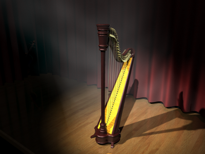
Did this pair for my directed study, continuing with the harp model.

 Click 'em for larger view!
The violin was done by another guy in the directed study group, and I think these two "characters" look great together. The assignment was to use exactly the same models and camera angle, changing only the lighting to put the focus on different things. I guess it's sort of a cop out to point a spotlight on two different things, but I did change quite a bit more than that. I'll give you a lighting breakdown, just for your interest?
Scene 1: Two spot lights both focussed on the harp, with fog (containing 3d volume noise) and raytracing shadows (raytracing shadows don't work as well as depth map shadows for blocking light fog, but I couldn't get the dmap shadows working properly, i.e. strong enough)
Directional fill light to lighten up the places outside the spotlight
Point light with negative intensity to blacken out the corner where the violin is a bit more.
Directional light behind the harp pointing at the camera as a "rim light" to give the main character a bit more shape and "kick".
Scene 2: Reduced intensity on right spot light
Point left spot light at violin
Remove light sucking point light
Give violin a rim light too
Realize that the renders look horribly different on each of my two monitors... really going to have to figure that out; so, sorry if the scenes don't look as good as they should... (haha, now you think they're supposed to be awesome even if they look like garbage to you...)
Oh yeah, and of the whole scene, I think I'm happiest with the curtains. I added a bit of bump noise to give it a velvety look. I think it sorta worked.
What do you think I should fix? Or your fav bit? And I won't be offended if you say the violin, cause it is pretty sweet.
Later,
Stuart

Fruity Awesome.
ReplyDeleteI like the lighting of the second one best, I think - I like the reduced intensity. You can see the detail in the soundboard texture much better (it gets a bit washed out in the first one with the double spot). Although I have to admit the fog is pretty sweet.
Oh, and yes, the curtains are pretty awesome too =)
ReplyDeleteGreat Job. Overall very detailed but with a bit more time you could add detail to the edge of the curtatin because it seems quite 2D in a way. also the curtain folds could be a bit more irrlegular. I know this wasn't the point of the project but if it was ... Keep it up
ReplyDeleteThanks for the comments. You're absolutely right, the curtains are completely 2D, they have no depth whatsoever. I did just want to whip something up quickly, so I basically created a sine wave and lofted it upwards. If I work on this scene more I'll add depth and irregularity to the curtains. And fix some lighting and fog problems.
ReplyDeleteSweet... I can't decide which I like more. I think the spotlights in the first one is a bit too bright... but I like the multi-directional shadows and the interaction of the harp shadow with the curtain. The velvetyness of the curtain looks great. I like the added focus on the violin in the second... but I think you should leave most of the focus on the harp. So, in other words, tone down the intensity of the lights in the first, and move the lights from the harp in the second to the violin in the first... if that makes sense. Also, the fog line above the violin in the second looks too straight and unnatural.
ReplyDelete