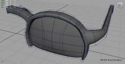
..or at least a wireframe of half of them. I think the model isn't too bad, but I'd kinda like to spend a few more hours working some detail into them, such as the hinges and nose thingies. I tried out some renders to see if I could get a nice reflective surface.

I'm not very happy with the final product, but I decided that it was quite time-consuming to just tweak settings. I can't figure out why the shadows are so blocky. I tried changing some anti-aliasing settings, as well as shadow resolution (the obvious place to start, I thought), but still not great. I think I need some solid theory/explanation for a large number of the very numerous settings and options. It seems as though the same options appear in several locations as well, such as shadows and illumination for objects, materials, render settings, etc. Lots to learn.

YAY!... Not too shabby (except the shadows... those look kind of shabby... but they'll come in time I'm sure)... I like the design... I was expecting more of those standard wrap around type... but I like the frame not being on the bottom bit... anyway... keep up the good work.
ReplyDelete~Daryl (in case you missed it at the top of the comment)
Yeah, for some reason I thought it would look better if I cut off the bottom of the frames. Now I'm not so sure, but I learned how to use the bridge function as a result, so it was worth it in the end.
ReplyDelete